The content of this website is no longer being updated. For information on current assessment activities, please visit http://www.globalchange.gov/what-we-do/assessment
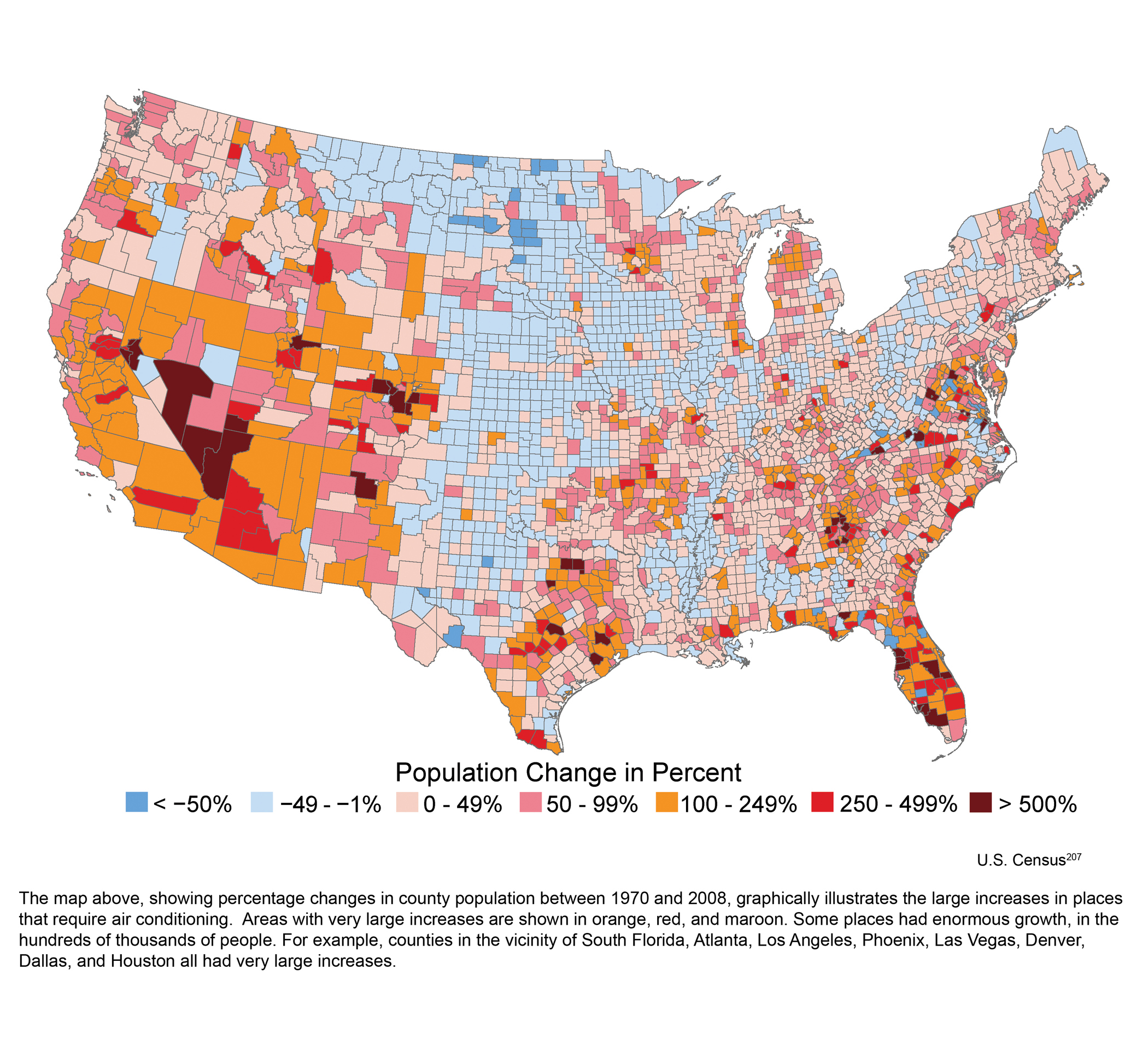
Change in Population from 1970 to 2008

The map above, showing percentage changes in county population between 1970 and 2008, graphically illustrates the large increases in places that require air conditioning. Areas with very large increases are shown in orange, red, and maroon. Some places had enormous growth, in the hundreds of thousands of people. For example, counties in the vicinity of South Florida, Atlanta, Los Angeles, Phoenix, Las Vegas, Denver, Dallas, and Houston all had very large increases. Image Reference: U.S. Census1
References
- 1. [207] Bureau, Census U. S.. Population of States and Counties of the United States: 1790-2000. Washington, D.C.: U.S. Census Bureau, 2002.
Summary
| High-resolution | High-resolution JPEG |
|---|---|
| Photo Credit | Rocky Bilotta, Earth Resources Technology |