The content of this website is no longer being updated. For information on current assessment activities, please visit http://www.globalchange.gov/what-we-do/assessment
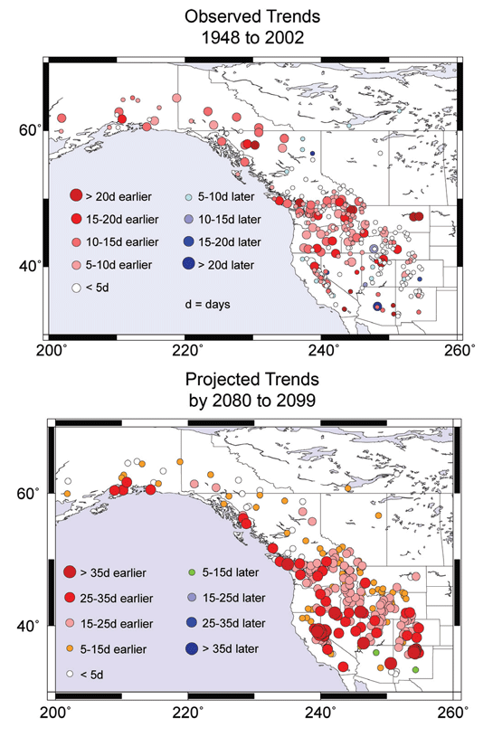
Trends in Peak Streamflow Timing

Top map shows changes in runoff timing in snowmelt-driven streams from 1948 to 2002 with red circles indicating earlier runoff, and blue circles indicating later runoff. Bottom map shows projected changes in snowmelt-driven streams by 2080-2099, compared to 1951-1980, under a higher emissions scenario.1 Image Reference: Stewart et al.2
References
- 1. [91] various. footnote 91., 2009.
- 2. [157] Stewart, I. T., D. R. Cayan, and M. D. Dettinger. "Changes in Snowmelt Runoff Timing in Western North America under a 'Business as Usual' Climate Change Scenario." Climatic Change 62, no. 1-3 (2004): 217-232.
Summary
| High-resolution | High-resolution JPEG |
|---|